Friday, 28 November 2014

OUGD405 | STUDIO BRIEF 1 | INTERIM CRIT

After undergoing a bit of market research, I decided my target consumers would be those who shop at places like Urban Outfitters, as their homeware is always a little bit quirky and even obscure. Since my focus is to add a little element of eeriness/creepiness, I think that this would fit in well there as a product.

I began to use some images I found on Tumblr as an experiment for this crit as I hadn't got chance yet to develop my own images; something I'm planning to do as soon as possible. In order to get a feel for the tones and image style I was going for, this was my only method at this time. 

I made these 3 examples on photoshop and added really vivid circles to them to contrast with the faded black and white tones.


The feedback I got was really encouraging and useful and helped me in deciding what to do next to further develop my process. Here are some of the suggestions and comments on my work:


The next step is now much clearer, this weekend I will go on an adventure to obtain some eerie images in a heavily wooded area that I can use on some similar designs to the prototypes I have produced here.

Wednesday, 26 November 2014

PHOTOSHOP INDUCTION | SESSION ONE

In today's Photoshop session we were introduced to the basic tools and functions that the software can perform. I have used Photoshop a lot in the past but I'm looking forward to finding out and learning new techniques and short cuts.

For this session, we also had a go at blending multiple film posters together and experiment with the different tones and colours. We were given a few images to use however you could use your own if you pleased.


 And from using these images above, I edited the colour and used the selection and eraser tool to create this image:


Monday, 24 November 2014

OUGD405 | DESIGN PROCESS | STUDIO BRIEF 1 | RESEARCH

Today we were briefed for the first brief of our new module, and for this we must design images for the backing paper of a photo frame.

These must be in a set of three; A5, A4 and A3. (4X6, 5X7 & 6X8) and must be created on Adobe Photoshop.
After having some initial thoughts on the brief, I decided I'd like to take some of my own photography for the frames. I'd like to have a nature theme, such as trees and flowers and general wild life.

I began to research some frames that can be found in the high street today. I started off with Urban Outfitters as I know they have a funky selection of homeware.

I found these frames on Urban Outfitters, and I really like the silhouette block effect of the deer.


I found this on John Lewis, since our brief involves shape, I noted the use of the circles in this frame, the colours seem to work really well too as they're sunny and bright, omitting happiness which is usually an emotion contained in a framed photo. The light, uppercase type appeals to me as well. 


I then found the following frames on Dunelm Mill's website:


 Although I don't really like the gold frame, these two photos have a textured, grainy feel to them, I also like the black and white. I definitely want to use black and white photos for my frames as they look serious and elegant.


Disregarding the photo paper on this frame, I especially like this style of frame for my theme as I think it will really match the dark, eerie black and white tone I plan to create in my images.


Saturday, 15 November 2014

OUGD403 | MODULE EVALUATION

Upon reflecting on the module as a whole I believe I have produced work that is of a good standard. During this module I have gone out of my comfort zone several times, since I was not experienced with manipulating and producing type. However I have found each of the briefs very enjoyable and rather challenging at times. I think as for brief 1 I could have produced more sketches and ideas instead of one refined idea in order to explore a bit more broadly. Even though brief 2 was slightly stressful in places, as I had to change my idea whilst developing it in Illustrator, I think I ended up with a really interesting typeface and I felt as though I had improved my skills on Illustrator and with use of type. I found brief 4 to be highly enjoyable as it was taking an idea from brief 3 that I personally found interesting to develop. 
Overall I am happy with the progress I have made throughout the module but I am excited to improve my skills even further.

Friday, 14 November 2014

OUGD403 | STUDIO BRIEF 4 | MESSAGE & DELIVERY | FINAL POSTERS


Text Only:

For this poster I used the slogan "Screw the Stigma". This is because I wanted something powerful, perhaps slightly controversial but not too offensive since mental health is already a very sensitive topic anyway. I decided to use Ostrich Sans pretty early into the brief because it was a font I am fond of and thought it would be really impactful. I liked the look of mixing bold with light. As for the background, it looked too empty on it's own, so I added 'negative terms' associated with mental health.


Text & Image:

As for text and image I scanned in some thread and used it as an overlay on my brain drawing. When I asked my flatmates what I could add to my brain drawing they suggested something to 'block out' part of it, so I decided on thread as it is very common for people to associate mental health with being unwired or having a lose thread. I thought it looked nice heavily saturated in red. As for the slogan, since I was keeping the same drawing for my image only poster, I wanted something different. I decided on "don't suffer in silence" as sadly that is what a lot of people do when having a mental health problem. It's hard to talk about it, since there is the stigma attached. This destruction of the mental illness stigma is what my message is all about, so I thought it was effective and relevant. I stuck with the same font in bold. The texture in the background is my favourite part as it adds a bit of depth to my poster and doesn't look too flat. I'm also a fan of grunge/collage/messy graphics.


Image only:

I stuck with the same image but experimented with other colours. I didn't want to use red this time as I thought black and white worked well. I added the "TV noise" texture to represent the isolation and loneliness people may face whilst suffering with a mental health problem. It is linked to the "silence" that I mentioned on my image & text poster too.


Overall I am really pleased with how these turned out, although I may have considered using colour in the image only poster as that was a good suggestion in our final crit.

OUGD403 | STUDIO BRIEF 4 | MESSAGE & DELIVERY | FINAL CRIT

Today I had my final crit on the posters for studio brief 4. We were separated into 6 small groups to discuss and present our work.

I received a lot of constructive comments regarding my posters. I was told that the message was very clear within my work and the use of the thread worked with this well, however it was suggested that I used a red thread on my image only poster as then it would match my text and image poster. I'm not sure I'd like to alter my final posters now as I thought black and white worked on that particular poster because of the isolation and dark suffering that is included with mental illness. I wanted it to be plainer than the others, but it is a good suggestion as then each of the posters would have the same colour theme.

The font I used apparently worked well as it was a strong message that I was conveying, therefore the font had to match this tone. Since it is bold and in uppercase, it was said that this was a good choice.

Tuesday, 11 November 2014

OUGD404 | STUDIO BRIEF 1 | NEGATIVE SPACE

Today in our workshop, we explored negative space. It was particularly interesting as I'd not had much experience with this and found it quite challenging as we didn't have that much time to design something.

To begin we looked at some examples of negative space, which I found really cool as I like how you sometimes have to look at a piece of design in different ways to fully see what's happening.


We were then asked to pick any word and reflect this using negative space. I chose the word Gun. I started making a few sketches, and decided that an obvious response would be to put an AK in the U.
This was my piece:


Monday, 10 November 2014

OUGD403 | VECTOR TYPE | EVALUATION

Now I have finished Studio Brief 2 and finished the typeface and grid, it is important to reflect and evaluate my progress on the task.

EVALUATION:

typeface - 

I created my typeface on illustrator, something I'd never used prior to being at LCA, so it was quite daunting to be introduced to it. However during the Illustrator workshop it wasn't as difficult as I had anticipated, we were told the very basics and worked up to more complex tools and methods. Since I had used Adobe Photoshop before, I did manage to figure a lot of it out from past experience as it is a little bit similar in some ways.

For my typeface I found it easier to use Helvetica Ultra Light (with reduced opacity) as the base for creating it, and simply used the line segment tool over the font. I then added dots to the 'joints' and just duplicated the same one so they were all the same size.

My original idea was to have the typeface as an 'outline' based from Helvetica Bold, but when experimenting with different letterforms I discovered that this was a little too complicated and did not look nice as it was extremely difficult to create an effective curve to the letter. That's when I tried out the 'single stroked' letterforms and found that they actually worked so much better than I originally thought. Whenever I had experimented with this, I had used lowercase instead of uppercase so I feel that this is what put me off. Here's an example:


The top section is the outlined version that I planned on taking to illustrator and the 'e' and 'a' below is created using single lines. I thought that this wouldn't look as good as uppercase but I had not tried to create all the letters. G proved to be very difficult doing the outlined version, however the more geometric letters looked much cleaner:


After experimentation to work around this problem I discovered that it did work better more simplistic, and I really liked how it looked much more than the outlined version. 


As for the creation of my typeface I found it quite easy to copy parts of the letters to use for other ones, for example the C could be flipped and used as the curve on the D so that they are similar and fit with the same theme.

I found that I did not need a grid throughout the development process as it was easier to just trace lines over Helvetica Ultra Bold on illustrator however since it is mandatory to create one, I made a simplistic one using illustrator and found that it fit well with all the letterforms.


Throughout the brief I had a lot of fun as I hadn't created a typeface before, and although I made some changes throughout the process, it was rewarding to see the full typeface when it was finished.

Sunday, 9 November 2014

OUGD403 | STUDIO BRIEF 4 | MESSAGE AND DELIVERY | EXPERIMENTATION

Image only:

I decided it would be appropriate to use the same image in my image poster as my image and text poster. I drew the brain and scanned it in, however I had a bit of an accident and spilled a drink on it. I actually thought this still looked cool and gave it a 'leaking' effect, so I kept it and used it in my work. I made a lot of variations of this poster as I wanted to make sure it looked the best it could be.  The leak turned out to be a suitable texture for my posters.


Text only:

For the text only poster, I wanted something short and snappy but still effectively communicates my message. After messing about with phrases I chose "Screw the Stigma", and experimented with this on Illustrator. I used the font Ostrich Sans as it is one of my favourites and it stands out really well.


After I produced this one, I was very happy with it but realised that texture counts as an image. This was a bit of a silly mistake so I remade this poster using text in the background instead:


Text and Image:

I wanted to use the same image for this as I thought it was quite powerful. I liked the idea of making the thread I scanned in really bright red so it stood out and looked effective. I tried a few different slogans for this one, and a few background colours.


Friday, 7 November 2014

OUGD403 | STUDIO BRIEF 3 | VECTOR TYPE | FINAL CRIT

Today we had our final crit for studio brief 3 in the seminar room. Our class was spit into groups of 2 so the size we were discussing our work to was bigger than usual. I discussed my typeface to the group and showed the four A3 sheets I had printed them on.


It was useful to see other people's typefaces and how they reflected their given word. 

Wednesday, 5 November 2014

OUGD403 | VECTOR TYPE | FINISHED TYPEFACE & GRID

I have now finished my uppercase typeface, and since I did not have examples of a lowercase, I chose to do some glyphs as well just to play around with how they'd look.

My typeface is fully based on constellations and their geometric, simplistic look. Star signs and constellations have been around for years so I felt that designing a typeface using these ideas was a good concept as it wasn't the most obvious response to the brief. It was also a lot of fun, albeit slightly daunting since I hadn't worked with the anatomy of type so closely before, never mind creating my own.


As you can see the designs are very ridged and geometric and do not allow for curves. I liked how, even though most of the letterforms were unique from each other, I could use various parts of one to apply to another. 

Now I have completed this brief, I would have loved to have attempted to create a lowercase version or maybe even a bold form. 

I created a "texture" that appears to be a starry sky by sprinkling sugar on my black sketchbook. I like how it looks worn and contrasts a little bit with the clarity of my typeface. The texture of my sketchbook has made the whole piece look a lot more interesting. 

Here is my typeface spelling out the star signs:


I thought this would look relevant to the word. I think I could have perhaps made the spacing a little more accurate in places but overall I'm extremely pleased with how this typeface has turned out and it has benefitted me greatly, and improved my confidence a little more on Illustrator. 

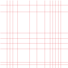
Also for the deliverables for submission of this brief, it is listed that we need a bespoke grid that helps us to form these letters. I designed mine on illustrator:


This grid is used for the entire uppercase typeface and is a good guide for the letterforms. I chose red because I thought this stood out. 


Tuesday, 4 November 2014

OUGD404 | STUDIO BRIEF 1 | FIRE EXIT REDESIGN

In today's session with John we were asked to look at the "running man" sign, commonly used for fire exits globally, designed by Yukio Ota:


The fire exit is an extremely important form of visual communication as it is, so we revisited and addressed issues such as language, culture and legibility. We decided on looking at the colour first, and discussed all the options.

We associate red with danger, therefore panic, and so we thought that if our sign was red this would evoke more panic on top of the situation. Orange was another option as it isn't quite red but would still stand out. However in the end we chose our sign to be a turquoise blue as this in my opinion creates a sense of calm, tranquility and safety.

We chose the pantone colour "Atlantis", which is a deep teal colour.

As for image, we drew up some experimental ideas with just text, but realised a little bit of imagery would make the sign more clear and effective and perhaps communicate the message more easily.
As a group we thought adding an opened door would be a good way to further enhance the message.

We then went onto illustrator and produced our sign using type and image in white. We experimented with black text but it didn't stand out as much as the white.


Overall I think our sign is simple yet very effective and I'm pleased with the colour choices and layout. However I think it may of been useful to address the direction in which the text and arrow is. 

It's also useful to note that even when given a brief, you should always question and challenge it. The original was already very functional and did the job, so why change what is already working?