My typeface is fully based on constellations and their geometric, simplistic look. Star signs and constellations have been around for years so I felt that designing a typeface using these ideas was a good concept as it wasn't the most obvious response to the brief. It was also a lot of fun, albeit slightly daunting since I hadn't worked with the anatomy of type so closely before, never mind creating my own.
As you can see the designs are very ridged and geometric and do not allow for curves. I liked how, even though most of the letterforms were unique from each other, I could use various parts of one to apply to another.
Now I have completed this brief, I would have loved to have attempted to create a lowercase version or maybe even a bold form.
I created a "texture" that appears to be a starry sky by sprinkling sugar on my black sketchbook. I like how it looks worn and contrasts a little bit with the clarity of my typeface. The texture of my sketchbook has made the whole piece look a lot more interesting.
Here is my typeface spelling out the star signs:
I thought this would look relevant to the word. I think I could have perhaps made the spacing a little more accurate in places but overall I'm extremely pleased with how this typeface has turned out and it has benefitted me greatly, and improved my confidence a little more on Illustrator.
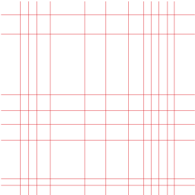
Also for the deliverables for submission of this brief, it is listed that we need a bespoke grid that helps us to form these letters. I designed mine on illustrator:
This grid is used for the entire uppercase typeface and is a good guide for the letterforms. I chose red because I thought this stood out.


No comments:
Post a Comment