Thursday, 28 January 2016

OUGD503 / STUDIO BRIEF 01 / D&AD / PRIMARY RESEARCH - POLLS

In order to gain more knowledge of what different genders look for in skincare, I posted 3 polls using Twitter. Twitter is an exceptionally popular media platform in our society and has a variety of users globally - I felt this would be an appropriate demographic for my own research. 


The first question was addressed to men only, however a limitation to this poll is that it cannot prevent women interacting with it. Evidently, men DO use skincare regularly in daily life, a result I expected. 


I then asked what attracts a male when purchasing skincare products. From the results branding had the highest score, meaning that whatever resolution I create must appeal to males by utilising appropriate branding and advertising methods. Expense closely followed by, implying that males may seek cheaper alternatives when buying skincare, and not really take into account branding or other factors. Males did not vote highly for eco-friendly brands, a very interesting result which means males are not as engaged with the environmental factors when consuming beauty products as they are with the packaging/branding and how the product looks. 


Wanting to also get a feel for what women look for in a skincare brand, the above poll was also posted to my twitter. There was a similar theme to males, however overall women are attracted to a product with a good price range. Cruelty free factors seemed to be more important here as well which is possibly due to the recent popularity in Lush products in the last few years, and the rise of a vegan, cruelty free lifestyle in younger people today. Again however, eco-friendly aspects are the most ignored.

In order to be able to appeal to a mass audience of both males and females, I must take into account this research. Choosing to ensure that the branding is appealing I feel is the most important task, whilst considering costs and cruelty free features to make the brand more attractive. 

Wednesday, 27 January 2016

OUGD503 / STUDIO BRIEF 01 / D&AD / PRIMARY RESEARCH

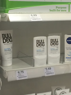
To gain a wider understanding of existing brands on the market, rather than simply using Google images, primary research was conducted in a local Boots store. This included a vast range of skincare.

The first noticeable thing was the segregation of female skincare product's to men's. This could be to simply allow the consumer to find their desired brand/product, however it also insinuates that it wouldn't be as desirable to mix male brands within female brands, perhaps due to a lot of masculinity issues that the modern male faces. They may be (if younger) taunted by peers, or feel ashamed to use these products if they are within the other 'girlier' brands, and take comfort in knowing that a brand is 'for men', validating use.


The women's section of skincare is bright, clean and colourful, which may not attract a male consumer. They may be put off by the branding involved. But this begs the question, why are females bombarded with extremely 'girly' brands, why can't there be a gender neutral section for skincare and even make up?


In comparison, the male section is predominantly darker, with use of harsh blacks, greys and navy. This communicates a more masculine aesthetic as blue is a colour that has been stereotypically assigned to the male gender, in comparison to pink for females. Male skincare appears to look like a tool more than a cosmetic product, and in a way this will reassure the male that it is justifiable to use as it is 'manly'.

In the women's section, brands simply used their brand name and then the product name but within the men's section, they seemed to predominantly use "men" or "for men", again to segregate the products so a man knows they are using a male product, which is an effective method for males who may have fragile masculinity. 


In these images you can see the brand "man cave", a phrase that describes a male's personal space or area, a term describing a room which a man does as he wants. This brand has used this term to communicate that males who will purchase this are free willed and do what they wish, whilst reaffirming masculinity. 

The second is "Bull Dog", a breed of dog which is classically known as being aggressive, hardy and of course, manly. The image an individual may picture when seeing this brand is a stocky male, again which would reaffirm the consumers masculinity and justify the purchase - they aren't using female brands, they are using a manly brand which of course will probably be almost the exact same product as a female would use, simply exercising different branding.


These brands are effective when appealing to men, but why do we need segregation and why do men need to feel masculine when using skincare? While creating this campaign it is important to appeal to both females and males simultaneously, keeping it neutral is the crucial point.  

Tuesday, 26 January 2016

OUGD503 / STUDIO BRIEF 01 / SECRET 7

BRIEF

"Secret 7” takes 7 tracks from 7 of the best-known musicians around and presses each one 100 times to 7” vinyl. We then invite creatives from around the world to interpret the tracks in their own style for every 7”. 700 sleeves are exhibited and then sold for £50 apiece. You don’t know who created the sleeve, or even which song it’s for, until you have parted with your cash - the secret lies within."

Taking part and fortunately being selected for last year's Secret 7 will give me a better understanding of the task this year and will perhaps allow me to create something suitable for this entry. Since this brief will be part of the responsive module, I would prefer to create something more substantial than one singular entry, and perhaps create a set that work separately or together, for either all 7 songs or a set for one song.

The songs this year include:

Chvrches - Clearest Blue
Etta James - At Last
Jack Garratt - Worry 
The Jam - Art School
John Lennon - Imagine
Max Richter - Dream 3
Tame Impala - The Less I Know The Better

This will be designing for print so I must take into account considerations regarding this and ensure the document is set up correctly. 

Tuesday, 19 January 2016

OUGD503 / D&AD / RESEARCH / EXISTING PRODUCTS

Verso


Verso is a skincare brand that exudes gender neutrality by absence of colour, the only decorative feature could be the large number on each product. This number is in stark contrast with the overall white packaging. As for their logotype, this is in a clean sans serif which would appeal to both genders effectively. Since these products are numbered, there would have to be a clear default range for it to be successful and the concept to make sense. The overall aesthetic could be said to gear slightly towards women however it is still gender neutral mostly as a lot of males may not be put off by the decorative serif number. Although designed well, what is the idea behind this brand? The concept is not as obvious as it perhaps should be.


After some research it was found that the name is pinnacle to the concept - Verso is latin for reverse, channeling the idea of being different and doing things differently, which is a good concept for a skincare brand as it is important to separate from the rest. 


Lush


Lush is a cosmetic giant in our society currently, becoming more popular than ever even outside of the UK. Their branding aids to omit a friendly vibe, the hand written type for each product conveys a conversational discourse, addressing the audience personally. The capitalisation is a way of installing volume and vitality, grabbing attention easily, especially on their iconic black packaging which is renowned for being eco friendly and promotes recycling; if you bring back 5 pots you recieve a face mask. Their branding appeals to their target audience of young adolescents who may be interested in eco friendly / vegan brands that help the environment and are against testing on animals. These morals are highly promoted in store and on their collateral such as the paper bags they sell the items in.


Yüli


Yüli is a brand that is obviously very clean and polished, again utilising no colour to preserve the 'bare' aesthetic. Their products look scientific or medical due to their packaging, which may eliminate the  risk of being too feminine and lacking appeal for males.


Corinne


Corinne skincare immediately has a friendly and relaxed 'organic' aesthetic, possibly communicating that the brand is eco friendly or cruelty free, or this may just be for visual appeal. The hand rendered illustration and pattern featured on the branding may indicate that this company is catered towards women more than males, as the majority of men are conditioned to reject anything remotely 'girly' and will not be interested in the brand. However, this brand could easily be attractive to men in regards to the more simplistic designs on the bottom section of the image. Men prefer products without any unnecessary fuss or decoration, from the looks of existing skincare tailored towards the male gender.


Clinique (For Men)

Clearly this skincare collection is catered towards men and men only as the series title "for men" suggests. It is interesting that these products are seen as 'feminine' in our society today and the only way to justify a male consumer buying a product like this is to label it with their gender - as though it is embarrassing to use skincare or make up.

From gathering this research it is apparent that the market lacks a suitable amount of gender neutral skincare / make up, and it is clear that the existing brands are usually catered to women - sometimes not out of choice, but because of the common consensus that these products are 'girly' and not for boys. For the branding I choose to create, I must bare this in mind and ensure that the product is as neutral as can be, and encouraging for males to consume.


Saturday, 16 January 2016

OUGD503 / STUDIO BRIEF 01 / PENGUIN / EVALUATION

The final resolution is a dark and contemporary refresh of A Clockwork Orange, demonstrated through the use of ambiguous imagery which reflects the plot line and keeps the reader engaged through a sense of mystery and a general tone of foreshadowing. The image on the front of the sleeve is a heavily manipulated ‘glitched’ image of the UK. Manipulating the image in this way further communicates the state of society in the novel, which is laced with crime and ultra violence committed by the main character Alex, and his friends. The colour palette chosen reflects the combination of human flesh, or human behaviour, with the dark side of crime. The dusted peach and jet black create an interesting contemporary juxtaposition of human nature ‘going wrong’. As the brief states, the entry should have an imaginative concept and original interpretation of the brief, which this resolution clearly demonstrates. 

This unique and modern resolution to a classic novel will not only engage existing fans of a Clockwork Orange but perhaps entice a newer, younger generation of readers through it’s mysterious and equivocal imagery, alongside the nature of the type, another essential request within the brief. This cover, due to the conspicuous elements, will stand out successfully in context, for example during sale on a shelf, in a library, or as the brief states, in an on-screen, online environment such as Amazon. 


I thoroughly enjoyed the design process for this brief, and it was an effective way to gain experience in the submission of live briefs. There was a lot of creative freedom which is always something I appreciate and enjoy. This brief allowed me to break down the brief set, and create a resolution that attempts to answer what the brief is asking succesfully. The most unsuccessful aspect of the cover is that the imagery is not clear, which could hinder the overall concept of the design. 

Friday, 15 January 2016

OUGD503 / STUDIO BRIEF 01 / PENGUIN / IMPACT BOARDS

Impact boards were also created as a means of concisely explaining the concept to judges if my design was potentially shortlisted. They are a professional way to showcase the submission, mocked up into a real life setting to display how the resolution would work in it's context. Alongside imagery, the text also communicates my design decisions and makes the visuals clearer.


Thursday, 14 January 2016

OUGD503 / PENGUIN / FINAL RESOLUTION


The final spread that will be submitted to the Penguin book brief competition. Designed for A Clockwork Orange the main feature of the spread is the large uppercase sans serif, enticing the audience from the first look, and setting serious authoritative pragmatics with not only the use of uppercase which instills volume, but the colour choice of black. A light dusty pink for the background of the cover contrasts brilliantly and incorporates a contemporary feel, modernising an old classic. The spine would perhaps be one of the first things the user might see, this is kept minimal with a black solid colour and white text, although simplistic, it does not distract from the elements on the front cover. 

The imagery used is an image that has been heavily manipulated of the UK. This was done to convey the downward spiral that the dystopian society set in the book is facing; corruption and violence are all heavy themes of A Clockwork Orange, and the imagery captures a somewhat 'glitch' that has took place for the UK to become so grim. Again the size and placement of the imagery is contemporary and leaves negative space letting the other elements 'breathe'. This was taken from my original manipulation here:


The use of geometric shape with a thick stroke is modern and adds another ingredient to the design. The composition overall fills the dimension. On the cover, the use of a long rectangle which intertwines and frames a selection of letters signifies part of the title "clockwork", the rectangle appears to be going clockwise around the letters, overlapping accurately.

The use of 'broken' word is also a contemporary aesthetic that hits certain trends within design currently.

Taking the feedback I gained during crits, I managed to create a resolution that is the most appropriate. It was said that in previous versions the text was not legible enough when placed with the busy manipulated image; a resolution to this problem was to of course make the title text bigger, bolder and eye catching, whilst positioning the other elements to compliment this design decision, therefore not overlapping image and text so it is much more legible.

Although during feedback a lot of peers could not tell what the image was, I think this adds an overtone of mystery and keeps the reader guessing. From the aesthetic of the image, you can definitely tell something is not right. 

Overall the cover effectively appeals to the target audience of young adults/adults and brings a unique concept that may not have been created for this widely redesigned publication.


Thursday, 7 January 2016

OUGD504 / END OF MODULE EVALUATION

The design production module was challenging throughout and really demonstrated the step up from level 4, which kept me engaged and striving to appropriately resolve the briefs. The briefs offered a chance to learn new skills within graphic design and acquire a new insight to the processes and considerations within a response. They allowed me to create work that I am proud of as a growing designer, and it is encouraging to see improvements as I keep learning throughout the course. Workshops and visiting professionals further engaged me into the projects set, and allowed me to discover methods of working which ensured a further critical understanding through research and experimentation. 

Brief 01 initially challenged me as it was the first brief set and the time scale to complete it was one week, meaning time management skills had to be polished and improved upon to ensure that the brief was completed appropriately. Considerations for this brief included the commercial aspect and communicating valuable content professionally and suitably, allowing me to reflect upon my own design process in the duration of the week. The use of creative hand rendered mediums appealed to the target audience of youthful design students with a passion for creativity. Overall this response could have been improved by revisiting the size of the leaflet and opting for thicker, non-matte stock to allow for a sturdier structure.

Brief 02 allowed me to begin to branch away from a style of graphic design I have held onto throughout the course previously. I wanted to experiment away from using a constant hand rendered approach as a safe zone and try more contemporary conventions by using vector. This brief allowed me to communicate with a client as it had a live aspect due to choosing an existing Kickstarter project to design for. I managed to create a response that I felt suited the brand and was an appropriate resolution to the brief, and that had successfully differentiated from previous work. In order to be able to submit something physical for brief one, I decided to experiment with screen printing. Since this module is heavily focused on production, this was a great way of experiencing a different production method. Due to human error that screen printing allows, it was not a perfect print however it effectively demonstrated use of neon colour choice and also a more adventurous printing method. I had to ensure that the inks I was using would be opaque enough for the black tote bag which was a crucial part of production; without this the outcome would not have been successful. Alongside this deliverable I created an online presence for the brand demonstrating uses of the logo on both screen and print.

Brief 03 followed from the Summer brief to collate images from a certain location over the holiday period. It was crucial to collect high quality pictures that would look professional in a publication. Engaging in primary research lead to enhancing my own critical analysis and further created a response with informed design decisions. For this brief I decided to engage fully with this and make the most out of it, and because of this the outcome was exceptionally rewarding, making this project my personal favourite. All the decisions I made were informed by considerations that are involved in print, ensuring that the response could be visualised being sold in an art book shop. From putting this resolution on social media it was excellent to receive comments from popular internet account People of Print. 

Brief 04 was exceptionally challenging. Being briefed by Only created a professional environment, alongside various visiting professionals who conducted interesting and realistic workshops which guided me into the correct direction and allowed for me to consider various aspects when designing for screen, such as the relationship with the developer and limitations during coding. I struggled initially with this brief but after further conceptual thinking and the use of wireframes, I eventually created an outcome that I am proud of and that is suitable. This brief was important as previous briefs have not allowed for purely screen based design, meaning throughout this brief I discovered a whole new side of graphic design that I know I still have  a lot to learn about, but that I am equally anticipating.

Overall it has been a challenge from start to finish, but has enhanced my critical analysis and quality of work as a designer, boosting confidence and most importantly allowing me to experiment with a completely different style of design that I will carry onto future modules.

Saturday, 2 January 2016

OUGD504 / STUDIO BRIEF 04 / EVALUATION


During my time on the course there has been a variety of briefs all catered towards designing for print, however there has not been a brief that has focused on designing for screen and the considerations that follow, as much as the Only website brief. Before beginning the course I assumed that designing for screen would be my preferred skill, however this brief definitely proved to be much more challenging than anticipated. 

Firstly there is a whole different realm of considerations to keep in mind when designing a website, from UX to screen dimensions and taking into account the limitations that may occur once the design has to be coded up by developers. It was important to achieve the balance of thinking ambitiously whilst maintaining a realistic point of view. I have managed to learn about another section of graphic design which I had hardly any professional experience in prior to completing the brief, by researching and my own trial and error throughout. 

As we could choose our own band or artist to create the campaign website for, this gave me a lot of creative freedom and ensured that I already knew of the band - meaning I somehow would have an idea of the type of design aesthetic I could come up with before properly immersing myself in the brief. In industry, this would not be the case, and the designer would not have as much freedom with the brief, the client is already determined, and may desire a different direction of design than the designer would choose. However, it was very engaging to be briefed by industry professionals; Only studio, who have had experience with many high profile clients such as Sony; completing a campaign website for Bring Me the Horizon. Many useful tips were shared with the class giving me a great start and a taste of what to research and consider. 

I did actually have the most difficulty with this brief, initially focusing too much on the aesthetics of the design rather than how to engage an audience to the full potential. With some more development and research I managed to change my idea and tweak parts that did not work as well, in order to create something visually stimulating and that also allowed the user to interact with and navigate with ease. By the end of the brief I was pleased with the outcome that I had created, which is crucial for any designer, as being confident with your work makes a lot of difference. This brief taught me to go with my instinct, if something is not working as well as it could, change it. 


Throughout the brief my time management could have been more efficient, and it would have been a lot quicker and easier for me to plan out what my idea was more in depth before going head first into the design. I ended up doing more work digitally than needed which wasted a lot of time that could have been spent on more important things. Looking at it positively, it gave me more experience and I learned a lot of important skills that can be applied to future briefs. It was also enjoyable which makes the whole experience a lot better.