Upon listening to the song I immediately didn't like it, it doesn't quite sound like the rest of the Rolling Stones' other songs. I didn't feel like I could create something and be interested in what I was creating from doing this song. I had begun to draw up some thumbnails but only managed to get around 10 when in the deliverables you need 30. In my opinion there wasn't as much creative freedom and options for this particular song.
My other favourite was Born Slippy .NUXX as I genuinely am a fan of the song and it has a very nostalgic and strange vibe to me, reminding me of the 90s and growing up. Listening back to it gave me a completely different interpretation than I had when I was younger as I obviously did not fully understand the lyrics or the context. I found the beat really chaotic and vibrant which I thought was a really great starting point for some thumbnails and designs.
It could be said that one of the most iconic pieces of album artwork is the design for Unknown Pleasures by Peter Saville:
It is the radio waves of a pulsar; CP 1919. The white on black looks extremely effective, stands out and draws you in. Even though the cover is just a photo of waves, it is still a successful and iconic design, perhaps because of the element of mystery and the way it just sits there without a title and even without Joy Division's name on the front. Peter Saville has designed a bunch of album covers for Joy Division and New Order. It's interesting how just lines can form one of the most renowned pieces of design.
"The duochrome Peter Saville cover of this first Joy Division album speaks volumes. Its white on black lines reflect a pulse of power, a surge of bass, and raw angst. If the cover doesn't draw you in, the music will."
-Susie Goldring
I branched out and researched some album covers that I find really well designed for different reasons, I tried to research a variety of genres however sticking to the albums I listen to myself at first as it is personal to me and my design process.
I started off with my favourite album of all time; White Pony by Deftones. The simplicity of the cover stands out so much to me, and even though I'm a little biased as it is by my all time favourite band, I still really admire the way it's designed. I love how it's just a simple line drawing outline of a pony, and the angles are captured interestingly, as it's not just a side view, the pony is tilted. Even though the colour choices are limited, black and white always work in my opinion and I think any other colours would have lost the concept of the album title.
As the song Born Slippy is very chaotic I tried to think of album covers that have that textured organic feel that I could get some inspiration from. It was easy to think of Sigur Ros as I listen to them often and have previously thought about how amazing their album covers are. They're usually delicate yet have a messy feel to them.
Here are a few of Sigur Ros' album covers that I think are particularly strong. My favourite is definitely 'Inni' by far. The use of 'cloudy' slightly distressed textures is something featured in my work very often, I love how they look especially with black and dark colours. The circles blended together look lovely, the only thing is since they're an Icelandic band I'm unsure what it is trying to communicate, however it is a live album so probably does not focus as much on the concept of the album art for this as they would be singing songs that already exist.
Using the website (insert here), I found this interesting album by Alexi Delano & Ambivalent /
Brooklyn Weekdays.
I love the texture of the ink or watercolour used. The overlap creates a really nice selection of tones of colour. Blending and mixing colours and scans is something I plan on doing in my own design as I think it has such a good look and would capture the beat of Born Slippy perfectly.
Watching the video I realised there was a distinctive colour theme of yellow and greys and even blue which I think sums up the themes in the lyrics. They mention chemicals which immediately I think of vivid blues and yellows and greens, so this was something I'm considering for my ideas.
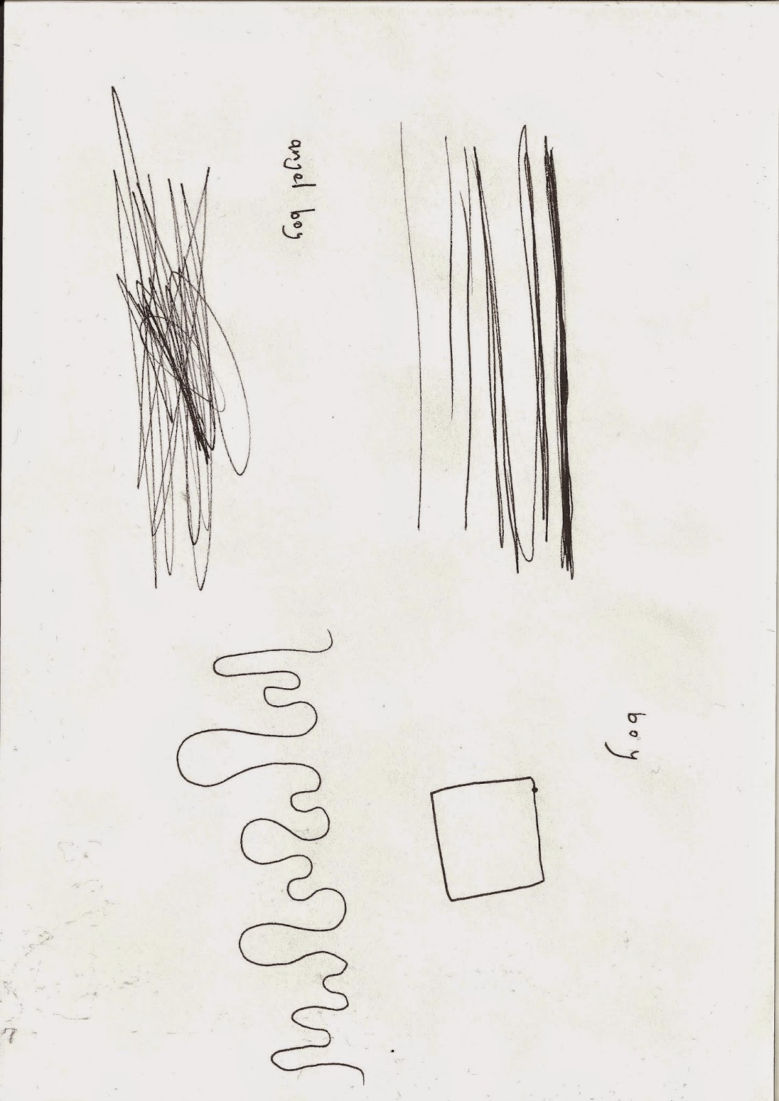
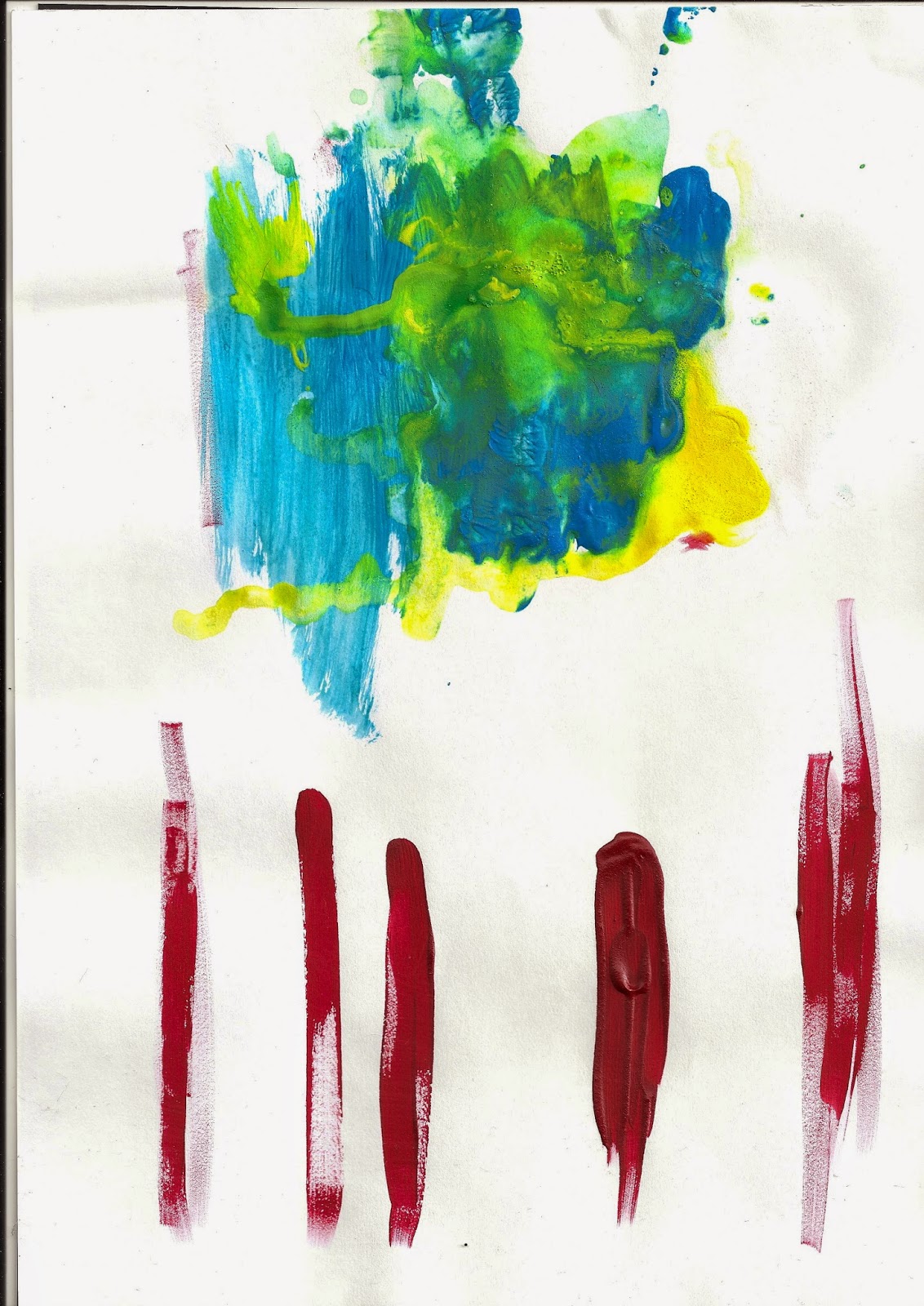
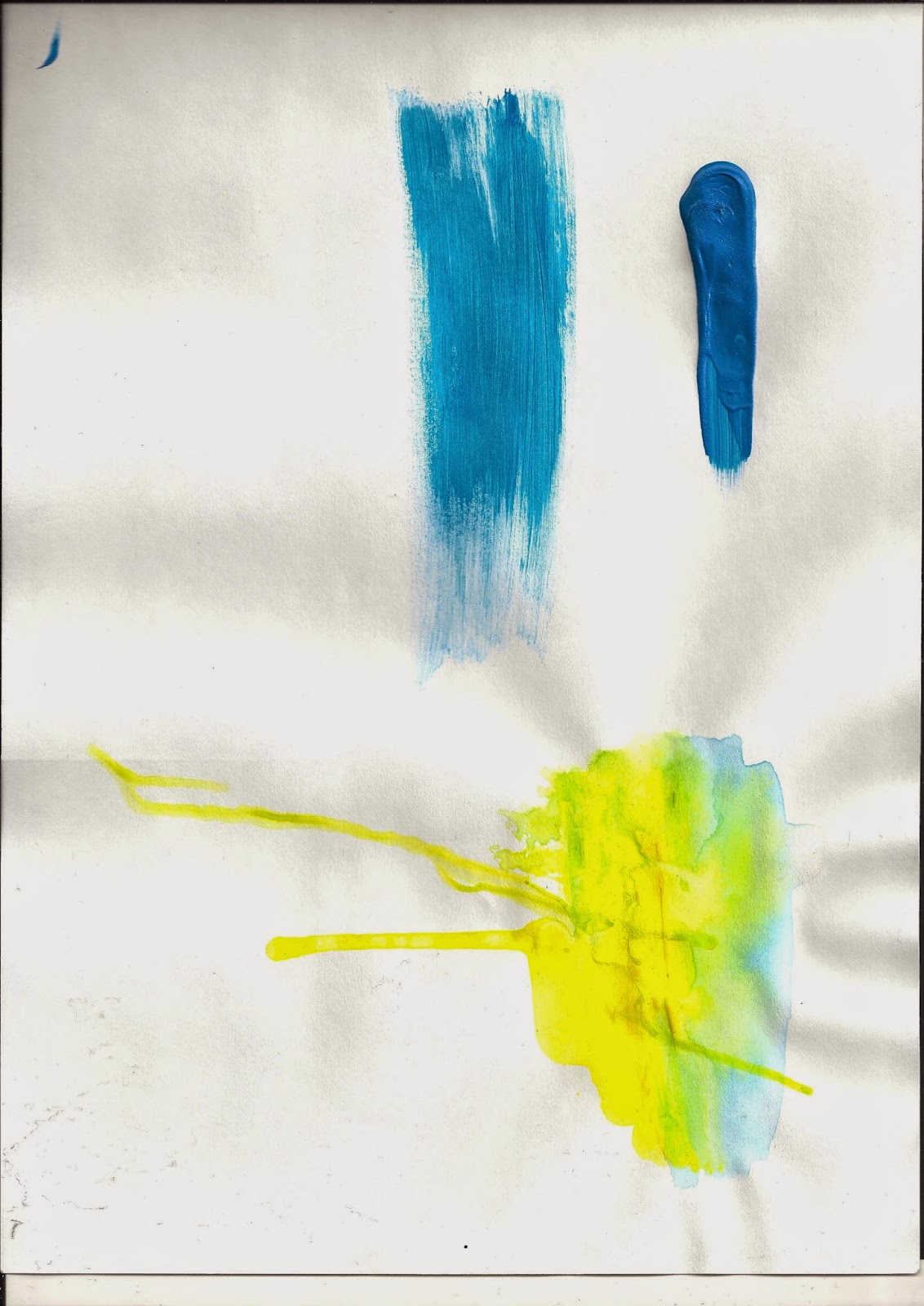
The spontaneity in the video is something I wanted to capture myself, so I began to experiment with paint and fineliner to achieve some different textures.


.jpg)


No comments:
Post a Comment