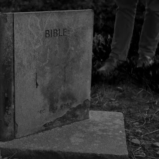
By using the images taken at the cemetary, I began to explore ideas digitally from previous sketches and initial ideas.
The first set includes images from the cemetary simply in black and white. Black and white has a classic, gothic feel especially due to the nature of the imagery here. The concept is, fundamentally, death and the themes that surround this end of life. The dark nature of the photographs communicates the harsh reality that everyone's life will inevitably come to an end.
I felt this achieved what I wanted, the bold lines and simplistic shape is honest and clear.
I also chose to try using only typography for one of my ideas, again taking the idea of 'sleeping' as the literal term of death. I used the dictionary definition of 'sleep' in this context, and this was the only element on the layout, making it the main focus. Experimenting with different alignments was beneficial to see which was the most successful. The text positioned in the lower left framed the shape of the vinyl sleeve well, however the central alignment is more focused and the audience would be focused on the text easily.


No comments:
Post a Comment