This was the first design I came up with, I did some line drawings depicting a looming 'giant' I also overlapped them and erased parts of the pink layer so it appears to wrap around the text. I don't think this design is extremely effective as the drawings distract from the text instead of compliment it. The colour choice was a bit random.
These are a little more minimal than the first design, I tried them in both white and black to see which was the most successful. I felt like the white design looks the most impactful as the paint looks a lot more focal. I'm not sure this really has any conceptual meaning, I can't really justify why I used the paint; however the text is in Futura because of the brand, which relates to the title and content of the book since it is all about brands and imagery in advertising.
 |
| The brand 'Obey's logo featuring the famous image of Andre the Giant. |
my scans of some hand rendered type I did.
These were very experimental as I wanted to try out hand rendered type. The lowercase is not very successful as it looks a bit too approachable which wouldn't really coincide with the content. The title is a imperative structure, it's telling the audience what to do. I want to be able to communicate how this sounds through the type.
For this design I chose a font that appeared to look digital and capitalised to convey volume and power. The lines add a second colour to the design, but don't have any relevance other than they look erratic and 'busy', like the advertising world.
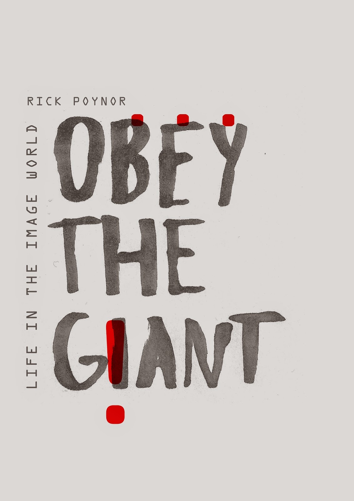
For this design I wanted to try out something hand rendered as I feel it has a different quality to it than just using vector or type. I wrote "obey the giant" with a copic marker and scanned it in, enlarging and editing the colour. I then decided to 'frame' the title with the subtitle and author's name, almost caging it in. The original cover had a lot of illustrations all over it, covering most of the page and had little room for text. For my design I thought I would change this and instead of using a load of images to convey the power of advertising, I would channel that through big, tall text which would connote the volume of the imperative structure. The punctuation also subtly conveys the power of the content especially the "!" that acts visually as an "i" and also the way imagery for advertisements bombards us everyday.
I tried out a variety of colour schemes but I think the most effective ones are red and yellow. Red obviously signifies danger and also relates to the brand "Obey", whereas yellow also conveys danger still, but a lot more subtly and compliments the layout as a whole.


No comments:
Post a Comment