Friday, 31 October 2014

OUGD403 | POSTER RESEARCH

As an introduction to Studio Brief 4, it is useful to begin researching into poster designs. I wanted to locate some relevant posters that I am particularly interested in. 

I started with a famous political poster that I took a liking to, Ben Franklin's Join or Die poster, as it is simple yet so effective. It also reminds me of an old 'biological' illustration:


This is a woodcut, depicting a severed snake. Each part of the snake is labelled with the initials of one of the thirteen American colonies/regions. Franklin's poster was published in his Pennsylvania Gazette. Through time, this poster has been recreated and republished in American history. This poster clearly created a big impact by using propaganda. Some other examples of famous propaganda posters include that of the American Uncle Sam poster "we want you". 

I also went onto looking at posters from nazi Germany, featuring Hitler. 

I think these posters are evidence of how persuasive design can be whilst conveying and interpreting a message. Hitler was a popular figure in Germany to begin with, and he managed to acquire so much power through his use of manipulation and persuasion of his people and his following.


I began by broadly looking into posters and advertisements for horror movies, to get a slightly different perspective on the use of posters straying away from the political angle. I instantly like the style of both the American Horror Story poster and the Blair Witch Project one as they keep the suspense whilst staying quite minimal. I like the effect of the solid black colour and then the tree silhouettes, and I like the sharp change of black dripping from the eyes on the AHS poster.

I then narrowed my search down to a specific company, Mondo, which is a selection of artists who create alternative screen printed movie posters. I found these posters on their archive:


They are very detailed but usually have a nice 'pop' of colour amongst the intricate illustration. I am a big fan of illustration so usually very detailed work interests me. Another designer, Eoin O'Kane,  has created an alternative poster of the Studio Gibli film Spirited Away which I really liked. It's a little bit different to the Mondo designs, as it's much more simple and is more shape based. Again, I like how minimal it is.


I decided to look into the differences between original movie posters and their alternatives which have been recreated and 'modernised'.

I found these ones which are probably my favourites:


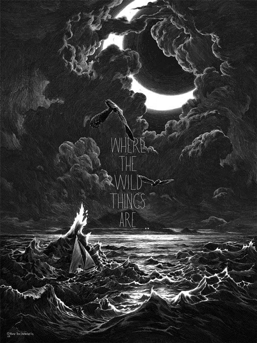
Following on from movies, I decided to look into music posters. I found a really beautiful design by Joshua M. Smith (Also known as Hydro74), for the band The Smashing Pumpkins. I love the splashes of gold mixed with the detail. Similarly, through some more research, in other words looking through Joshua Smith's twitter following, I found Derrick Castle who has done some posters of a similar nature. I really enjoy the dark tones to these designs and feel they are appropriate to the style of design I'd be interested in creating. 


Thursday, 30 October 2014

OUGD403 | STUDIO BRIEF THREE | RESEARCH PRESENTATION | FINAL CRIT

For this brief I have chosen to look into the "Allergic to Cowell" story and how there is almost an element of humour to a woman's phobia, even if it is quite irrational!

Following on from this, I have decided to look into the different ways the news represents mental health. I have specifically focused on comments regarding Robin Williams and Amanda Bynes to see the contrasting opinions.

Of course these are two different circumstances, however I do believe that the reports on Amanda Bynes' 'breakdown' can come across as very unsympathetic and mocking, whilst Robin William's death sparked a debate on how we must begin to remove the stigma and be more educated on mental illness.


I received positive comments on the aesthetics of my presentation and how it was bold and to the point. The use of information and statistics was also something people liked, however it would possibly have been a little more clear if I had extended the concept of having to actually die for mental health to be taken as seriously.

Tuesday, 28 October 2014

OUGD403 | STUDY TASK THREE | CRIT

During today's presentation of our newspaper layouts, our group was paired up with group 4 and both of us talked about how we went about completing this task. We received a good amount of feedback and critique that has helped us think to further improve our design.

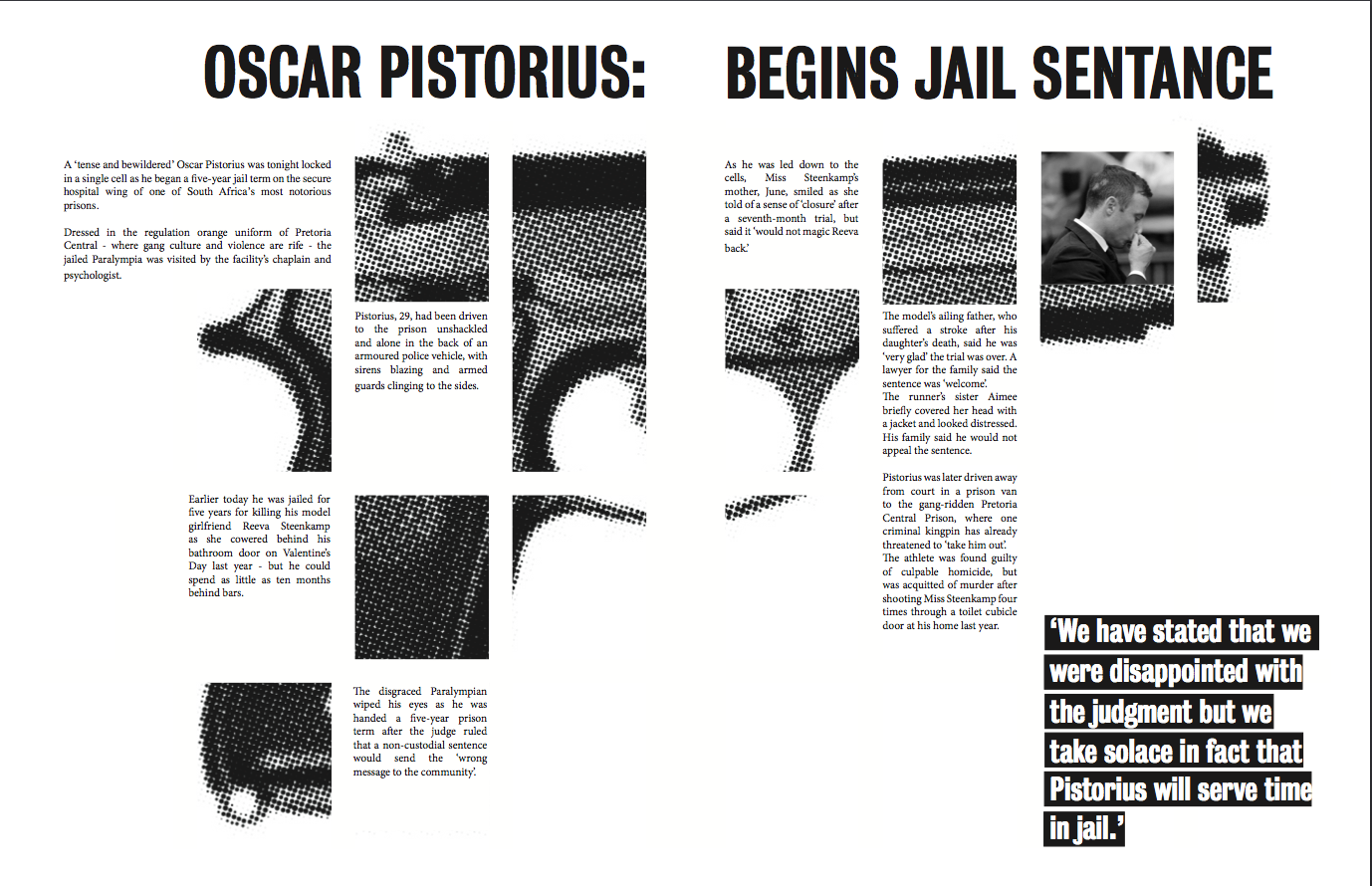
our layout we created.


The first issue that was raised was the readability of the title whilst it was in a magazine. It could be argued that the word "begins" when stapled into the magazine may become hard to read and break down the title structure. A way to improve this problem would be to have the title on just one side of the layout or maybe use the text more tactically to ensure that a word does not get caught in the middle.

Another thing that was mentioned was the alignment of the text. We decided to align the text to the right, as it simply looked better with the sharp edges of the gun image. Questions were asked by the other group as to why we decided to do this and that it perhaps would look better flushed left or justified. However they did say that since we have such a 'quirky' style layout that it could work.

Overall though, group 4 really liked the way we had gone about the task and how the layout wasn't your average, traditional article. They thought it fitted well with the target audience and it would be appropriate for a university magazine.

Improvements:


Here we have edited the alignment of the text, and whilst keeping the headline spanning the whole of the double spread, it would now be easier to read when stapled in a magazine.

OUGD403 | INTERIM CRIT | STUDIO BRIEF THREE

Yesterday we gathered around the crit box in groups and discussed the stories we had researched over the weekend for Studio Brief 3. I had initially picked the "Allergic To Cowell" story, but I was also debating over researching more into the Plastic surgery story:


It was very very useful to have these ideas discussed, as I wasn't sure if I could take the Cowell story further as much as I possibly could with the botched operation story. I realised that quite a few people had chosen to research into the plastic surgery story, and even though there's quite a few angles to go about it, the crit has helped me realise that I should go with my initial choice of the Simon Cowell phobia story.


Although this is the only copy of the story that I found in physical newspapers, I have found some more online from the Mirror & the Metro:


I think an interesting angle on this story to take forward would be how women are reported on in tabloids like the sun. For example in this story, Michelle, who has the phobia of Simon, is referred to frequently as "a mum" or "a woman", in quite a mocking tone. This could lead on to researching ideas around gender roles and how women are seen as either domesticated, good to look at or apparently crazy.

I could bring in other ways women have been targeted by the mail, and the specific tone it is reported in.

Another angle that could be brought in is how mental health is represented in the media.

Overall the interim crit has allowed me to focus on one story and various ideas in which to go about this brief.

OUGD404 | STUDIO BRIEF 1 | COLOUR THEORY

We were asked to bring in 5 objects that are a certain colour as we were playing around with colour. My colour was red. We were then told to organise them from light to dark in a line.


It was quite a difficult task. Lining the objects up in shades became quite confusing as it made you begin to question the colour at all. For example this book looks red but against the other shades it begins to look a shade of orange.


We then had to organise the colours from cold to warm which was again quite challenging as we couldn't decide if a certain shade was warm or cold.

We had to try and figure out the warmth or coldness of some of the colours by placing them on a yellow or blue shade and see which blends in better.

After this task we added everyones colours into a big circle:

Overall it was really interesting to see the ways colour can trick our eyes and alter in different scenes. When placing different yellows over the white paper it showed a different shade that what we previously thought. I also learned a lot about the temperature of shades and how to distinguish between them.


Sunday, 26 October 2014

OUGD403 | STUDIO BRIEF 3 | MESSAGE & DELIVERY

Studio Brief 3 is to create a body of visual research in response to a story, issue or theme found in the national press for the 25th of October 2014.

This brief must include a physical copy of the story and a body of research. 


INITIAL RESEARCH

On the 25th, I bought the Sun and the Mirror. I like the contrasts found in the Sun as they are, it could be said, a lot more cheaply reported in such a notorious way.

For example, the front page story for the Sun was titled "I'm allergic to Cowell". This immediately intrigued me, even if I wouldn't like to admit it. 


The front cover of the Mirror is "X Factor Sam: My child snatch terror". I found this quite interesting how both of the front pages were X Factor related. I think this says a lot about our society and media today. 


Another prominent story was about the woman in Thailand who has sadly died from a plastic surgery operation which went wrong. I felt this was quite interesting to research as this is of course is not the only bogus surgery report. 


The same story is also reported in the sun too, but I found it very interesting to note how differently worded the headlines are:


Lexemes such as "butcher" and "kills" create a semantic field of aggression and violence. Quite a bit more abruptly reported than the other newspaper. But thats just how the Sun tends to report on stories.

Another set of reports included in both newspapers are regarding Ashya, the boy who's parents took him outside of the UK in hopes to get him the treatment he needs. 


However I am unsure if I want to report on this as even though it is someone's life, it perhaps might be too depressing to research.

The same applies to this story:


However this is a very specific and highly isolated incident. I think the common response to this story is obvious - outrage and disgust. I don't think I'd like to research this.


OUGD403 | STUDY TASK THREE

On friday, we had our briefing for study task 3, which included research into layout and composition; specifically for newspapers. We were divided into separate groups of 5 and given an article headline. The headline my group had was "Oscar Pistorius given jail sentence"

When we began to research into this we discovered there was heaps of reports and information on the story. Sometimes we found that there was often a bombardment of information and this may jeopardise the layout being too over facing for people our age. We decided to be concise with the amount of text we would use on our layout, and also wanted to stray away from the 'traditional' column grid of a usual newspaper. This was a method of attracting an audience of a similar age to us.

-images-

For our layout we wanted to use a large amount of image and perhaps a large display text in order to draw the readers in. We researched some images that may be suitable:


Out of these images above, it could be said that the two featuring blood would be a little bit too much for sensitive viewers, but the bullet holes image could be used to break up some of the text we would be using.

Through further research we decided that a gun would be a suitable image to feature with our text, and found out that the gun Pistorius used was a 9mm hand gun. We decided to incorporate this feature into our layout and created a grid. The gird we used was a 4x4, featuring an image of a gun and text inserted within it. We kept it so that you could still visually see it was a gun. Times new roman felt like a suitable font for our body copy; however for our title we chose a tall, condensed looking font named 'Bureau Grotesque, which is more bold and eye grabbing. Just the right tone for our headline.

We inserted a picture of Oscar into our layout to bring a face to the story.

Something I particularly like about this layout we created is the use of halftone on our image. The use of black & white sets a serious tone, alongside the 'fuzziness' of the image. 

We also used Bureau Grotesque in the white for the quote in the lower right hand side of the layout, and added a black background, which allowed for it to have significance and stand out. This was a quote from Reeva Steenkamp's mother, so we felt it was very appropriate and added a lot of context. 


This is our final layout.

I feel as though this layout is quite modern and strays from traditional layouts you may find in a newspaper. I think that this is what I like about it the most. I like layouts that sometimes push past conformity. These tones are what might appeal to our target audience. 

Some cons of this design is that it could be said the columns are a little too narrow for comfortable reading. However I believe that if I saw this layout in a magazine or newspaper I'd be more intrigued to read it than if I saw a traditional, ordinary layout for the same story.


Friday, 24 October 2014

OUGD403 | VECTOR TYPE | FINAL CHANGES

I have decided to stick to just uppercase as this was the easiest format to work with, with the geometric style of my letters. It was a useful learning curve as I actually discovered my initial idea of outlining the letters didn't work as well as I thought. The more angled letters seemed to co-operate well as I didn't have to create as many 'joints', however some letters just did not look right at all:


These look appealing, however I then tried to create "G"….

As you can see this letterform just had too many dots as I was trying too hard to curve it in the shape of an outline. I decided to revisit my other idea of just having single strokes and found this worked so much better.

I have now decided to stick with no outlines and just use single strokes for my letters, as I also don't want my type to be over facing, rather just effective in a minimal way.

Thursday, 23 October 2014

OUGD403 | VECTOR TYPE | TOO MANY DOTS!


Whilst developing my letters I have encountered a problem trying to create curves. It is extremely hard to achieve a good curve whilst staying in the outline, I am planning on trying out just using a single stroke in illustrator and perhaps using a different weight of helvetica to base it off as I want my typeface to look a lot more neat and simplistic than this G, which looks silly and full of dots. I think I need to try and experiment more within the program to see if a simpler version that isn't outlined would work better.

Tuesday, 21 October 2014

OUGD404 | STUDIO BRIEF 1 | ANAMORPHIC TYPOGRAPHY

In our session with Amber today we were asked to bring in lots of cardboard, and to design an anamorphic letter using depth of field. There had to be no less than four layers to our letter, and we needed a 'view finder' to look through in order to see the letter in it's rightful placement.

We were in 3 groups, and our group decided to do a capital 'A' and use paint to accentuate the depth of the letter. We also decided to add serifs. 


As you can see this was our starting plan.


We cut out each individual piece of our letter using the cardboard, and used red paint for the Cross bar at the back. Then we made each piece gradually lighter using white paint.


During construction, and also a snap of our 'window.'


And here was the result. I especially liked the use of colour to add to the depth of field. You could really see how effective it was even from the back of the studio. It was a really hands on task but it proved to be quite fun to see our letterform take shape as the session went on.

As for the other groups, here are some photos of their letters: