Grids:
Grids are an important feature of the majority of design, whether it's layouts of type, books, websites or newspapers. During this study task I am planning on collecting some primary and secondary research on the use of these grids, which we may not notice are being used in most of the things we see everyday.
Four types of grids -
- Manuscript grid
- Column grid
- Modular grid
- Hierarchical grid
Manuscript Grid:
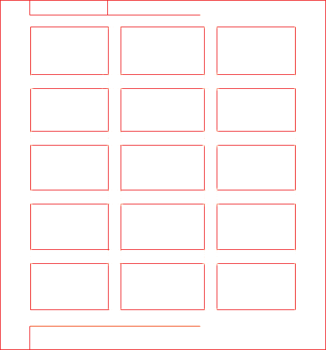
As seen above this grid is also referred to as the block, as it is the simplest structure of grid. It is used for a large area of text, that will take up the majority of a page. This grid is suitable for books or essays for example. Images can also be added to a manuscript grid.
Column Grid:
Column grids are multiple columns placed in a grid, as the name suggests. They are commonly used online, and for when there is discontinuous text. If the colums are too wide or too narrow this makes it a lot more uncomfortable to read.
The columns could be used for images or text.
Column Gutters-
When the margins are wider than the column gutters, this guides the eye to the centre. This creates less tension than when the margins are narrower.Modular Grid:
Modular grids are similar to column grids except they contain horizontal or vertical divisions in rows, acting as the grid 'cells'. They are usually useful for more elaborate designs, that contain a mixture of media; for example image galleries.
They may have a lot of flexibility but can become confusing when the grids are more intricate.
Hierarchical Grid:
These grids are used for an assortment of elements, and are commonly found online. They have varied proportions but still contain relevant information. Even though these placements start off sporadically placed, they are then organised into a suitable format.
Hierarchical grids are usually appropriate when the other grids cannot be used.
An example of a hierarchical grid that I have found is the one that is displayed whilst looking at a tumblr blog's archive:
An example of a hierarchical grid that I have found is the one that is displayed whilst looking at a tumblr blog's archive:
However the grid cells are all the same width, but I think this still adheres to the hierarchical grid layout as the images are 'slotted' spontaneously together.
Fibonacci & the Golden Ratio:
This is based on the Fibonacci sequence, following a 1:1.61 ratio, evident in design and in nature. It forms the basis of paper sizes and these principles can be used to create balanced designs.
The Golden Ratio is said to be the guidelines of making something attractive to the eye.
The Golden Ratio is said to be the guidelines of making something attractive to the eye.
It is said to have been used for at least 4,000 years in human art and design, but some say that the pyramids were built using these principles. It is even said to be used in the piece that depicts Jesus at the last supper:
In modern design, some have suggested that the Apple logo was designed using this ratio, but this has not been confirmed. Apple have also been said to use a golden ratio in their app logo designs:
It's even been said that if a face follows Fibonacci's ratio then it is more 'beautiful'.
Even though this can be applied to some of the design around us, I feel as though there might not be solid truth in the use of this ratio, and it may be down to personal opinion whether something needs to fit this ratio to be considered 'aesthetically pleasing'.
Canons:
Canons are used to measure and describe proportions.
Van de Graaff: Secret Canon:
Used to measure and divide books to pleasing proportions, commonly in medieval manuscripts and incunabula. Known as the 'Secret canon'.
This canon is still used in modern design today:
I think the Van de Graaff canon can be relevant in today's design as it makes layouts clear and visually pleasing. The proportions look accurate and easy to view.
Tschichold:
Tschichold's canon positions the text box in perfectly whole units. This canon is also referred to as the Golden canon, and the circle in the grid determines the area of the type and the height. The diagonal line determines the width. The proportion ratio is always 2:3:4:6.
The Van de Graaff canon is similar to this canon as they both use methods to make the text area look pleasing and in perfect harmony on the page.
Tschichold also created the Octavo canon:
It is commonly used within film, photography and graphics.
Tschichold also created the Octavo canon:
This is used to determine the margin proportions and the print area. As you can see the diagonal line running from the bottom left to the top right and the other line are there to determine the best places for margins and print areas, ensuring that the proportions are just right.
Rule of Thirds:
This is the idea of an image being split into thirds, or nine equal parts, and the main focus of the image work in these horizontal and vertical lines. Alignment with this grid is said to create better tension and ensure the image is interesting to look at.
For example I found this useful GIF on wikipedia, which shows an image cropped and uncropped. As it shows, the image that follows the rule of thirds looks perhaps more interesting.
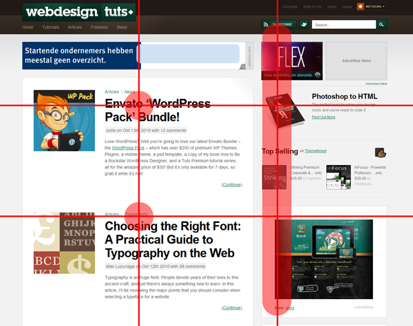
And the rule of thirds can also be seen being applied to various websites and web design.


No comments:
Post a Comment