With ideas freshly in my head I went forth to do some online type research relevant to my word.
I started with the most, in my opinion, obvious theme. The 'older' style types. I thought that fancy, decorative drop caps resemble a traditional era. I began to research into these for inspiration.
IMAGES FOUND ON GOOGLE IMAGES
I have experimented with the over emphasised floral decor and squared in drop cap, whilst using Helvetica as the starting point.
Delving deeper into the historical angle, I also decided to do some research, still focusing on decorative style drop caps, but different styles to fit in with different eras. For example Victorian looking letterforms.
 |
| By Belinda Shih |
I really like the use of florals to shape the actual letterforms as opposed to being used in the background like the others I found.
Astrology to me, is a very traditional concept and one that I am shamelessly interested in. I think turning some of the star signs into a letter would fit with the brief and resemble something traditional, manipulated.
For example, my sign, Scorpio resembles an "M".
Further more, I think that there are some really interesting type used in old, 'traditional' circuses, that I think would be relevant and fascinating to research into. I think of circuses to be a traditional part of culture, in the past and present, and even though I would never attend one, I am fond of the type used to advertise them.
 |
| By Antonio Rodrigues |
This carnival style script is very inspiring to me, making changes to Helvetica to fit with this style would be a hard albeit interesting task.
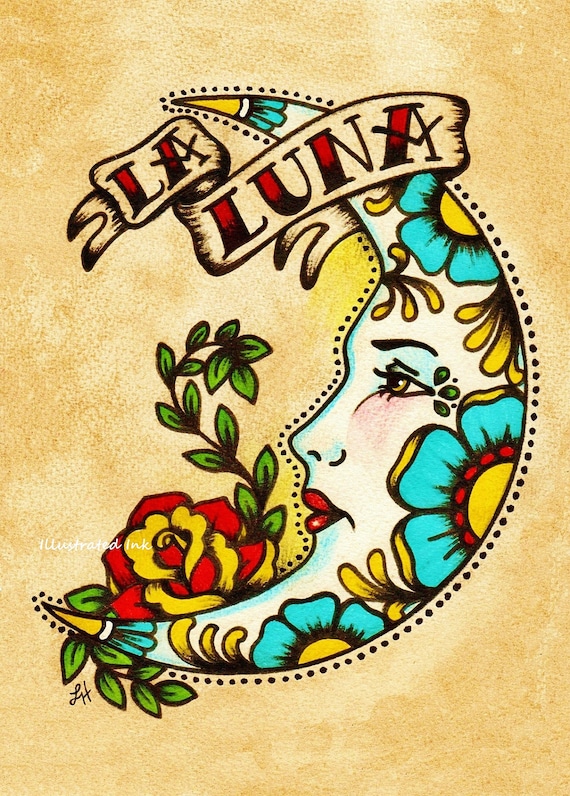
Another interest of mine is tattoos, there is a distinct style of script for 'traditional' tattoos. I've taken inspiration from this for this task.
 |
| "La Luna" script by IllustratedInk @ Etsy |


No comments:
Post a Comment