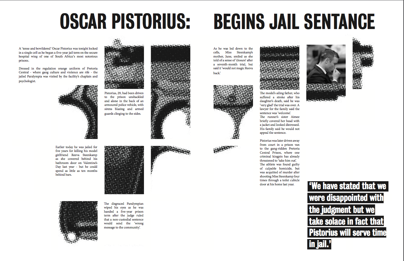
our layout we created.
Another thing that was mentioned was the alignment of the text. We decided to align the text to the right, as it simply looked better with the sharp edges of the gun image. Questions were asked by the other group as to why we decided to do this and that it perhaps would look better flushed left or justified. However they did say that since we have such a 'quirky' style layout that it could work.
Overall though, group 4 really liked the way we had gone about the task and how the layout wasn't your average, traditional article. They thought it fitted well with the target audience and it would be appropriate for a university magazine.
Improvements:
Here we have edited the alignment of the text, and whilst keeping the headline spanning the whole of the double spread, it would now be easier to read when stapled in a magazine.


No comments:
Post a Comment