- go with your gut
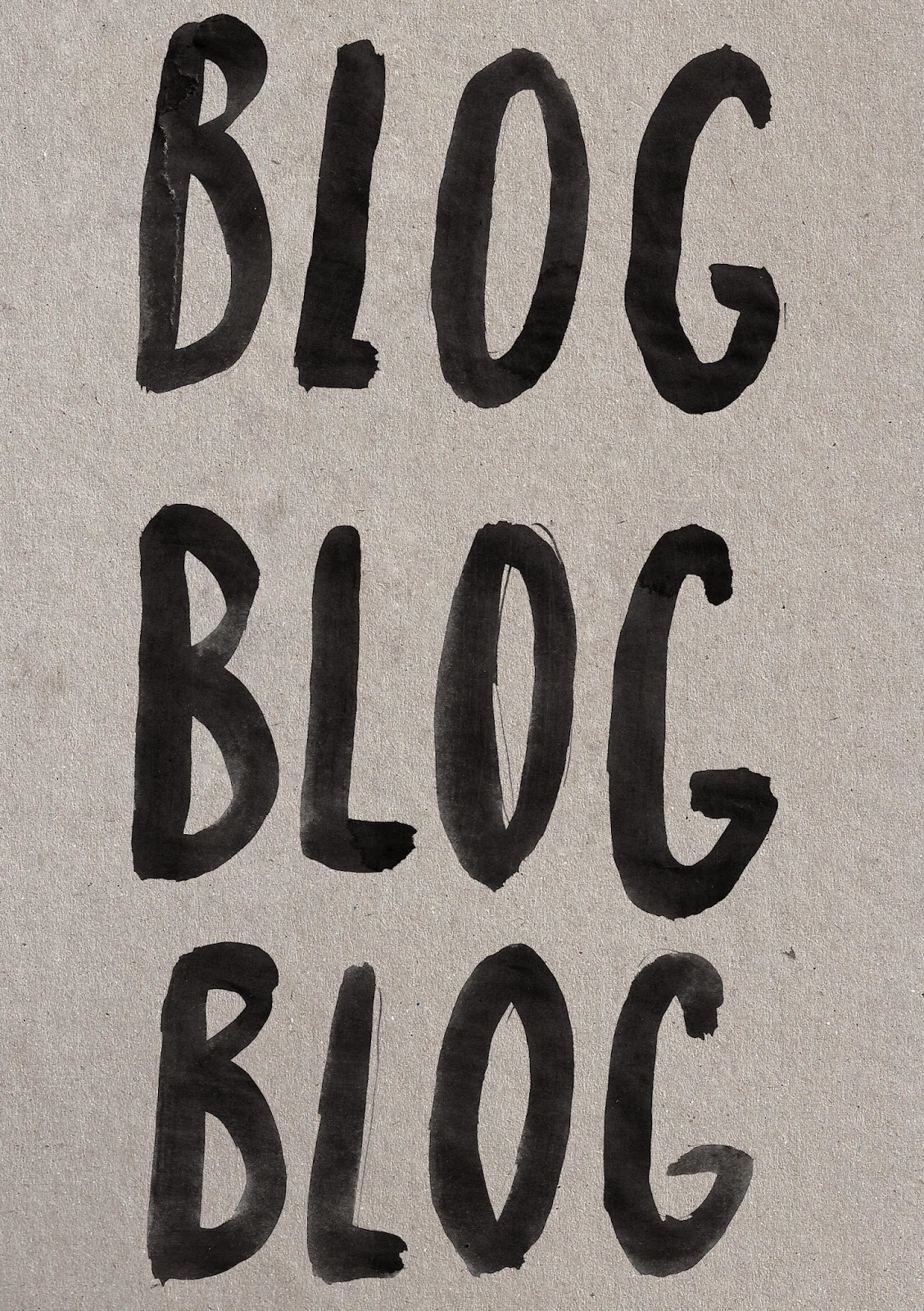
- blog blog blog
- crits
- find your style
- its not all digital
- don't compare yourself
- making friends
- anxious? talk to someone
This was the first set of letterforms I made but when I began to use them they didn't have the look I wanted, something just wasn't right about it. I think they looked a little too neat and thick. The 'don't worry' however I felt looked nice and I started creating the cover of my zine from this scan.
I didn't have a set colour scheme in mind at this point but I was leaning towards a pastel colour, or the bright aqua green for the whole publication. I did some mark making to create some patterns which I decided would look best on the back cover:
I then began to experiment with the content. I wanted to capture a chaotic, spontaneous vibe trying out hand rendered titles and other elements.
I began by experimenting with a font at first. I wanted something capitalised and bold because that was my preference, however in retrospect, I feel this may look too 'loud' as Bebas could be said to convey volume and is a little too ridged. As I have used hand rendered type on the front cover I thought it would make sense to use it throughout. As for colour I tried out a pastel pink colour after getting inspiration from this image:
I found this image on designspiration.net and really liked the off white background and pastel yellow colour alongside the hand done type. This is the aesthetic that inspired me for my own zine.
The shape on my page is also extremely experimental, It began as a brush I had created on photoshop and used the liquify effect on it. I was simply messing about to be honest and found the shape I made really interesting. I thought it would match the page about anxiety as it reflects how being nervous feels, all mixed up:
Some more examples of rough experiments with colour and texture, along side my own type. These didn't really work for me though as I preferred using a brighter colour, so that it's more fun and lively and inviting than looking a bit too serious and dismal which that mustard colour looks.
These designs are much more to my liking. I used some of my scans to create a messy hand rendered effect, which I'll be doing consistently on all the pages.
Here I have incorporated colour using a square to separate from the grey background. Added splatters to match the other pages, but I want each page to look a little different than the last. I tried this design in yellow but felt the aqua blue looked more calming and yellow could subtly represent danger. I increased the gamma correction on my type to make it a more bolder black and then felt the words looked better closer together.
Here I added the colour through my type, after deciding firmly to use the aqua blue. I also decided to add my own photo of my uni pin fineliners, as they're my favourite pens to use for drawings, and personal to me. I also added the same pattern as the back cover to match and have a running theme.
Again the entire page is hand rendered (except the text content that will be added). I used salt on brusho to create the background. It creates a lot of different darker shades alongside the lighter ones.
For these two designs I have also used the scans of my brusho ink and inserted a 'column' of it whilst overlapping the type. This is to fit in with the whole 'no grid' system I've been working with for this zine.


No comments:
Post a Comment