I chose to screen print deliverables such as:
- Tote bags
- Tshirts
- Menus
- Posters
- Burger wrap paper
This was quite demanding as I needed both types of screen, fabric & paper, and altogether four screens of designs, but I knew that I would have a better chance of achieving the colour I needed to with this print process as the ink is a lot different to an inkjet printer who can only produce colours in CMYK.
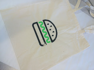
I started by printing my tote bags. The design I chose was simply my logo without any text, in order to generate conversation and encourage the logo to be a well known icon such as the golden arches of Mcdonalds. The design was split into two, the burger and the sauce, which was quite easy as it would only require two colours and printing sessions for both textile deliverables.
Overall the totes came out good, however parts of some of the totes were not perfect, a couple of bags had a patch of ink missing from the black part of the design was discouraging.
 |
| Successful tote |
 |
| Tote with error |
This was simply from human error which is sometimes expected from hand printing methods. If this was to be produced and distributed professionally, it would be a better idea to screen print these designs using a machine instead of hand printing.
The tshirts however were successful. I printed two tshirts and both came out pretty much perfect which was rewarding. Due to the shape and size of the tshirt, I had to manually place and hold down the silk screen, using eye to line the design up centrally, instead of clamping the screen. I thought this would be difficult however since the design was relatively large it was easier to line it up this way.
The menus were also screen printed however I digitally printed the image of the burger to speed things along and ensure a flawless image as it is full bleed. If this image was patchy it would look unprofessional. The menus were very disappointing to me, for several reasons:
Firstly the neon green did not come out as rich as I had hoped. I used the fabric medium I had used on the totes and tshirts to try and get a consistent shade; if I had mixed acrylics it could have looked out of place if the shade was not right. However, possibly due to differences in the mixture, the ink turned out much more faded and soft rather than bold and fluorescent. There was also quite a few errors in the prints, such as parts not printing solidly, the screen getting blocked by the black ink, and too much ink on the green rectangular sections.
The position of the design was in an awkward place, right at the edge of the silk screen, therefore I feel this had a part to play, making it more difficult to print than if it had more space around the design.
A positive aspect to the menus is the stock choice. The eco friendly off white GF smith stock manages to look sleek as it is not too 'recycled' looking, yet the colour and feel of the paper looks more eco friendly than a harsh white colour. The appearance is authentic and relaxing and the thicker weight of the stock keeps it more durable than a thinner choice.
It would also have been good to experiment with lamination to prevent any grease or stains spoiling the menus, as in context they would be placed on the tables in the restaurant where people will be eating food.
The black areas of the posters were again printed digitally to save space on my screen and speed things along efficiently. Again, wanting to achieve a level of continuity in my work, I used the same fabric pigmented ink. There was only a small part to be screen printed, and these turned out successful apart from one annoying blob in the middle of one of the posters:
Again, these were intended to be much brighter, however the fluorescent effect is still apparent. More pigment in the ink could have solved this, if I had tested the ink first it could have been more successful.
The burger wraps were not usable due to how the screen was exposed. The negatives were not black enough, meaning the designs would print grainy. This was disappointing, but if this was printed professionally, the designs would be printed onto proper greaseproof paper suitable for food wrapping. If I was to complete the brief again I would expose the designs properly and try looking into this more indepthly, however now there is not enough time to dwell on this.
overall I'm pleased with how many deliverables I screen printed as previously to undertaking this project I have been pretty incompetent at screen printing and avoided it if I can. Now however, I enjoy the process of screen printing and will definitely do it again in the future and improve my skills further.
I think screen printing was a relevant choice for the brief too, as since this is a restaurant attempting to reach a mass market, the hand made feel of screen printing makes it more authentic and organic, but does not compromise on the professional and sleek aesthetic.


No comments:
Post a Comment