Saturday, 31 October 2015

OUGD504 / STUDIO BRIEF 03 / MOCK UPS


In order to ensure that the final publication was exactly as planned, I decided to print out some mock ups to test out the sizing and binding for production.


Staple binding is easy, does what you need quickly and is cheaper to reproduce at a larger scale than other binding methods. There is less room for human error however there is the risk of something going incorrectly with every binding method you could choose from. Another plus of staple bind is that there is less to focus on with the binding; the user will be able to concentrate more on the content than how the publication is bound - something I would consider as important as the photographs within the publication are important.


I initially thought an A4 size publication would be suitable as I could scale the images large in order to capture a lot of detail, however to make an informed decision I mocked up my publication scaled down to A5 as well.

This made the publication lighter and more pocket sized, yet the size of the images meant less impact as they were much smaller and it is harder to see the details. I had to decide whether the portability of the publication was more important than the quality of my images. 

The above examples show experimentation with a saddle stitch binding method in both A4 and A5 size. A4 is larger and required more holes in the spine because I did not want large areas of thread, as I did not think that would be as secure. This left an attractive stitch. The smaller mock up only needed three holes overall. 


Saddle stitch would keep my publication together efficiently however I was concerned about the thread obstructing the photographs, which is what I want all the focus on when the user is interacting with the publication. If the thread is not tight enough the book will eventually become looser, something that is not a risk with the staple method; once the staple is in, it will only become unsecured if pulled on purpose.

It was also suggested that I could hire a service to perfect bind my book, however due to the restrictions regarding deadlines for this brief, this would be unfeasible as it would take time to send away for the files to be printed and then sent onto a binding company. I emailed Diamond Print Services which also confirmed that this idea would not work for this current brief as there would not be enough time to get this completed within the deadline. However if I was to do this, I would be certain that the end result would be attractive and reliable, yet costly.

Personally I feel the staple method would be the most appropriate option; keeping production costs lower and faster whilst preventing distraction from the purpose of the book, all while keeping it intact. Hopefully during final production this method will work efficiently and there will be no error.

Friday, 30 October 2015

OUGD504 / STUDIO BRIEF 03 / INITIAL COVER EXPERIMENTS

In order to grab the audience's attention, the cover of a book does matter and must be eye catching and well designed. Imagery used is extremely crucial to the overall aesthetic of the publication and definitely sets the tone for the rest of the content.  It should be consistent and fit a sustained theme throughout. 

The images I captured in Poland were not solely type, for a personal project I wanted to capture images of the religious locations throughout Krakow, as religion is evidently a very significant aspect to the community. Everywhere you go there is multiple chapels and holy locations to be seen. An image like this would be suitable for the front cover however there is the argument that the image should contain type as that is the topic of the publication. 

Whilst experimenting, the title of the publication was not definite, rather just an appropriate text to work with for this stage.


The first idea generated was the above 3. Using the same imagery taken from Poland's holy locations, but edited into fluorescent IK Blue. Problems with these compositions include not printing correctly as they use RGB colour inks. They could be reimagined in less vibrant colours that can be correctly printed in CMYK. These layouts are actively created to be contemporary, using geometric shapes with thick stroke weights, or solid colour.


Experimenting with text alignment created a lot of options and ways to fill out the page, instead of just placing one text box horizontally. 


Also trying these variants using the same images, I simply experimented with colour and overlapping contemporary shape. For the middle image, through use of kerning, I made sure the i and the l were aligned horizontally down the cross.


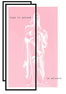
Here I have utilised the same overlapping rectangles, however one side is obstructing the Virgin Mary. These shapes are geometric, contrasting with the detailed imagery and the solid colour really pops out. On the third image, I feel the type is too spaced out and does not look as effective as the prior examples.


OUGD504 / STUDIO BRIEF 03 / COVER / STOCK


In order to make an informed decision about the choice of stock for the cover, I experimented with two colours I thought would work well, and a gloss. 


The red is used here to symbolise the Polish flag. The rest of the content of the publication is in black and white, so a vivid injection of colour would bring it to life. This stock looks good however does not seem effective enough as a front cover. The image does not pop out as much as desired and it is very bright and could be overfacing instead of attractive.


This baby pink is light and brings out the image and type well. Pink softens the overall tone of the publication from the harsh black and white imagery within and on the cover. Baby pink is also a contemporary colour and compliments the black well. 


The final experiment was on white gloss, which was what I initially thought would work the best. Black and white instantly pops, and the gloss gives it a lush feel. Problems I faced was the folding; the stock is not as thin as the other two examples and so folding this paper was not as easy yet still worked. If I was to do this again I would score the middle to achieve a crisper fold. Fingerprints are also easily noticeable on this stock, which could pose a problem for the audience when using the book over time, or if it was in a shop - over time the amount of people picking up the publication would show these fingerprints.


Since there are only two colours used for these mock ups, this maintains simplicity which is a principle I want to sustain throughout the publication. 

Thursday, 29 October 2015

OUGD504 / STUDIO BRIEF 03 / SKETCHES


I began to sketch up multiple different layout ideas using a key to separate and signify what is text and what is imagery. These gave me a better insight into what layout decisions to make during production of the publication and what would look most appropriate for the overall feel of it. 

Experimenting with text & imagery and also simply imagery allowed me to consider various options such as only having an index, creating more space for the photographs to breath and speak for themselves. The content that has been collected for this brief is very impactful in places such as the images from Auschwitz, and I believe this definitely speaks alone and does not need a large amount of text cluttering the pages. 

I also considered quadruple images on a spread, with text slotting in suitably. For a layout like this, in order to keep the spreads consistent there should be a grid system used. 


Wednesday, 28 October 2015

OUGD504 / STUDIO BRIEF 03 / RESEARCH / GRID SYSTEMS


It is important to consider and explore grid systems whilst working on a brief which relies heavily on layout. Although they are not necessary, grid systems create order and add ease to creating aesthetically pleasing layouts, maintaining consistency. Grid systems give structure using margins, columns, inter-column spaces, lines of type, and spaces between blocks of type and images. The very function of a grid is to ensure readability and ease for the user.


Golden Ratio / De Divina Proportione:


a to b = 1:1.618

a+b to a = 1:1.618

The Golden Ratio is a harmonious mathematical proportion that has been used and studied in mathematics and the arts since Euclid (Ancient Greece). Pacioli coined the term ‘Devine proportion’ (Italian Renaissance). It is often credited as being able to deliver aesthetically ‘pleasing’ and harmonious composition.


This ratio can also be applied to type, dividing the header by 1.618 and using that number as the body copy size. This apparently creates balance which makes the text look appealing.


Pros:

  • Works more effectively for web design
  • Keeps order 
  • It apparently looks aesthetically beautiful
  • Harmonious design results

Cons:

  • Questionable theory
  • Limits the designer
  • Not essential to create good design
  • Outdated 
  • Tedious


Examples of the Golden Ratio used within graphic design:


Van Der Graaf canon:


The Van Der Graaf canon is a historical method of dividing a spread/page into pleasing proportions. Whilst using this specific grid, proportions are maintained and appear aesthetically pleasing to the user's eyes. 

Tuesday, 27 October 2015

OUGD504 / STUDIO BRIEF 03 / RESEARCH / BINDING

The binding method is a crucial aspect of a publication. Fundamentally, it is what keeps it together and preserves it for as long as possible. Since we will be creating a publication of our own I thought I would dedicate time into researching the different binding methods that I could possibly try out for my own work. 

We are creating a publication designed to display all 26 letters of the alphabet, so perhaps it is a wise idea to be aware of how much content there will be, obviously which will result in more pages. Since there may be a number of pages, it could be said that the binding method I choose will have to cater to this and keep my publication together fittingly, and will help to preserve it from damage or wear and tear. However I would like to consider a range of methods in order to evaluate which method will be the most appropriate in the end. This will involve a lot of mock ups and trial and errors, which will be challenging and time consuming (but worth it!).


Saddle Stitch:


I began by looking into the simplistic nature of the saddle stitch. Though pretty basic, this binding method is functional, minimal and uncluttered. It effectively keeps your publication together and would ideally hold around 8-80 pages together as an estimate. I personally favour the saddle stitch because in all honesty; it's easy. It does exactly what you need it to do, without fuss and inconvenience. It's a classic and does not distract from your design. The cons of the saddle stitch include being less tenacious than other binding methods and it is not adventurous and likely requires less skill than a more complex bind.


An example of an interesting style saddle stitch was a notebook provided by GF Smith during a talk. There were many different examples of the stock choices however I noticed the really beautiful binding:


Using a saddle stitch with a lot of sewing creates a brilliant line down the side of the publication. This could also allow the publication to be more secure as there is more of the spine covered by the binding stitch.


Perfect Bound:


Perfect binding is a punchless binding method that works by fastening the book block to the cover spine. The sections are rough-cut in the back to make them absorb the hot glue. The other three sides are then face trimmed. This is what allows the magazine or paperback book to be opened. The perfect bound option looks professional from the outside. It's impression is clean, sophisticated and even traditional. With a perfect bound book, the more pages the better. This type of binding allows the book to lay flat while open, something a saddle stitch is not able to achieve. Perfect binding requires more effort/skill the larger the book is. For this brief I am planning on designing a publication with a lot of pages, so this may be a problem I would face with the perfect bound method. 

During a book binding session at Vernon Street, we attempted a perfect bound book by using two pieces of board and mesh for the spine. We used a book press to keep the pages still and glued the mesh to the spine side. After it was dry and cut down, it did look very neat and professional however the problem was that the pages easily became loose and would fall out with usage. I would not want this to happen with my publication, I want the user to be able to use it without the risk of easy damage.


I looked at a selection of different binding methods from this collection by Diamond Print Services. They showcased a large range of binding methods that may be suitable for my own publication. 


Case Binding:


In binding and finishing, a means of binding pages together involving the sewing of printed signatures together with thread followed by encasing the signatures between cloth-covered cardboard covers.


Above is an example of case binding that I especially like, bound using cloth. Adding cloth creates texture and a different overall feel to the publication than paper can offer.


Burst Binding:

This method involves using hot melt adhesive with sections of burst perforated on the spine to allow additional glue penetration. This binding method is recommended for binding documents where additional strength and instant binding strength is required. 


Similar to case binding, this method looks clean and organised and is suitable for a larger publication. It will be a strong consideration for my own publication however I would have to think about how to do this or even getting a service for this as I would want it to look as professional as possible.


Stab binding:


This method uses single sheets rather than signatures, meaning for this book you can use different stocks, weights and colours as each page is separate. Stab bound books have holes away from the spine, which are then bound together using string/embroidery thread. This method is relatively easy and adds an element of decoration to a publication. It looks more flamboyant depending on how the bind has been done, than a regular saddle stitch or staple bound book. 


Other examples:


This example of a publication involves different sizes/shapes of stock, creating a very strange look when folded and closed. To achieve this, the designer would have to measure out the shape and size of each piece of stock and make sure it is  accurate. I'm unsure if this method would be suitable for this brief as it would have to have a stronger contextual link, however it does create an interesting shape.


This book has a sleeve, created by a different size spread wrapped around the main cover. The mint blue colour stands out against the black and white, protecting the cover and also being successfully pleasing to the eye. It is great to consider a sleeve or protection of some kind as after a while books deteriorate and become less crisp and new, it is important to bare this in mind. 


Book Binding tutorial:

<images>

During a sign up tutorial at Vernon Street, I experimented with different binding methods that could be applied to my publication for the brief. These mainly included perfect bound variations. 

For example this entailed stock being sandwiched between two pieces of mount board, secured in a nipping press and glued together by a piece of mesh. This method looked very neat and professional but would not be the most durable binding, as over time pages can fall out easily as the spine endures wear and tear from use.


OUGD504 / STUDIO BRIEF 03 / RESEARCH / LAYOUT & IMAGE

In order to progress with this project it is essential to research vigorously into each different section of a publication. Here is a collection of different trends and image finishes that could be considered for my own publication.


Duotone / Monotone:


An interesting method of editing images is Monotones, duotone, tritone, quadtone. This is a greyscale image printed with one, two, three or four ink colours. This method is a simple way to interject colour into a publication or piece of work. Using this method creates consistency especially in a publication with multiple images which is relevant to this current brief.


Neon / Fluorescent colour:


Fluorescent and bright coloured elements instantly capture the audience. The vivid nature of this type of ink is very contemporary and a current popular trend in design right now. Problems the designer could face with this is that they would have to work in RGB rather than CMYK, posing an issue with printing as these colours cannot be achieved via inkjet printer, as they are not in the CMYK spectrum of colour. A way around this would be screen printing or looking into getting this printed specially using inks that aren't available here. Screen printing would work effectively however it is time consuming and human error may cause inconsistencies and incorrect printing.


Type:


Above is a design by Sam Wood created for his BFA Thesis, documenting how design can enhance worship and areas of spirituality. I particularly took a liking to this publication as the images I personally collated throughout the trip to Poland featured a lot of religious elements, for example type and imagery in chapels, chapel undercrofts and other religious monuments. The way in which the black letter type is modernised by the utilisation of negative space and the combination of the contemporary sans serif Apercu is what makes this publication unique and exceptionally effective. Interjecting colour through a contextual choice of dark green is also successful, further reflecting places of worship. A splash of colour is another method of keeping a publication interesting without over-facing the user. 


Illustration / Pattern:


Illustrations, whether simple or more detailed, can further strengthen a piece of design as there is another element for the user to look at alongside type. As seen above, these simple line illustrations fill the page and create something interesting and attractive. They are simplistic yet effective. 


Hyphens:


Browsing Trend List, it is hard not to come across the use of a hyphen to split the words into two lines or more, sometimes used because of the filling format, sometimes for no reason at all. Hyphens have become a popular trend in graphic design today, and I'm partial to a good hyphen. Using them breaks up the type and creates an interesting composition.

Black & White:


Due to the nature of the images collected for my publication, black and white may be the most suitable finish. It is classic, timeless and can work well with any colours alongside. Black and white imagery can create certain atmospheres; for example classy and sophisticated, or eerie and ghostly. As seen above, paired with the crisp white space, this publication looks clean and organised. Lack of text creates breathing space for the images and allows them to speak for themselves, something which I feel I will want to explore within my own creative process. 


Sunday, 25 October 2015

OUGD504 / STUDIO BRIEF 02 / EVALUATION

The logostarter brief was quite daunting at first as I personally had very little knowledge and experience of creating logos. I was not initially very drawn in by the brief until I had searched the Kickstarter website for a while and realised there was a lot of choice and opportunities to create something really effective and push myself.

I really threw myself into this brief and engaged with it a lot especially over the week long period of designing and experimenting. I thought the brief was challenging especially because of the time aspect; this was only a week long brief so the time for creating was cut quite short. This can be seen as a positive as the brief is not dragged out, nor can the designer put all that work in at the last minute as that would be the cut off deadline by the end of the week. Realistically, I could have tried to keep within this time frame much more efficiently however I really wanted to see my work on a physical deliverable, and so I decided to print on tote bags. The screen printing process is not as speedy as simply printing a piece of work out down at the digital print room, so, to get this part of the brief completed, I had to run over time slightly, however I did get the majority of the work done within the week long period.

Throughout the brief, I saw my creative work become a lot more mature; it was great to experiment and try out a new style, still adapting to the process I work with, but a different style to what I would usually go for. I recognised that a successful logo is usually clean, bold and simplistic. These were the conventions I wanted to adopt for my own work, however I do not usually feel comfortable with more simplistic design which is something I definitely want to change and challenge myself with in the future briefs. I was happy to notice that I certainly did that for this brief, creating a logo that I was proud of and pleased with.

This brief also allowed me to exercise my communication skills with a ‘client’. It was exciting to be able to present my finished work to the owner of the Chonaic brand and receive praise for what I had created. It gave me the opportunity to improve my professionalism and added the live element to the brief which makes working on it more realistic and fun.


I made errors, in particular with screen printing the totes which is a shame as I can be a bit of a perfectionist, nevertheless I am satisfied with the amount of effort I put into the brief and any mistakes made can always be learned by for the next challenging brief set. 

Thursday, 22 October 2015

OUGD504 / STUDY TASK 03 / RESEARCH / PRINT FINISHES

The selection and inclusion of print finishes can elevate your design aesthetically and improve its potential for retention. However, the selection must be appropriate for the concept and content of the design. The task given today is to investigate at least 8 types of print finishes whilst considering the following:


  • processes involved in applying the finish
  • financial considerations
  • suppliers
  • audience/communication
  • potentials for the current project
  • design and preparation considerations

Embossing:

Embossing refers generally to the raising elements of the page to add emphasis and physical depth. This print finish creates dimension, something the user can touch; usually specifically on logo, type, pattern or illustration. Often this method can be paired with other print finishes enhancing both effects, for example foiling and embossing can work together to create something very visually attractive for the audience.

An example of embossing on a business card.

Letterpress/Debossing:

Letterpress printing is one of the oldest printing techniques available. Some printers may call letterpress printing by the term debossing.

A letterpress is used to depress or indent certain portions of the page. It can be seen as the opposite of embossing.

Traditionally, the letterpress technique was used only for applying ink on a page as a form of relief printing and usually only for text. But it has evolved to also include pressing logos and other design elements directly into the paper substrate.


Foiling:

Foiling is the process of using heat and pressure onto a surface to apply a metallic material. Colours can range from gold, silver, black, copper and holographic etc. 


Spot UV Varnish:


Spot UV varnishes are paper varnishes applied to the printing surface and is cured or hardened by UV light during the printing process. This results in a glossy coating on the surface of your print.

UV varnishes are usually used as a spot application where only specific parts of the page get a UV varnish. This effectively gives texture and focal interest to different areas of the printing surface while leaving other areas untreated.


UV Varnish Pros:
– can be used to enhance specific areas such as text, logos or images rather than cover a whole page
– additional substances can be added to varnish to increases its versatility such as glitter
– can be used in conjunction with a laminate and printed over the top to create a more creative and diverse result.

UV Varnish Cons:
– if printed over a crease in a document it will crack in the same way ink does
– if printed over text or images will be subject to ‘make ready’ die charges which increases its cost
– due to additional set up required uv varnishing is a longer process than lamination

Lamination:

Lamination adds a layer of protective coating (usually some type of plastic), often glossy or matte, to the printed surface while also improving its sturdiness and water resistance.

Lamination also has the added benefits of improving the tactile feel of the of the printed surface, lending it a smooth finish.

If a high gloss laminate is applied to the printed surface, photos and images appear to have more contrast and have better sharpness.


You can also have a more subtle laminated finish.


Lamination is not unlike varnishes. However, whether lamination or varnishes are to be used in a project is wholly dependent on your needs and your desired outcome.

Typically, lamination is used if sturdiness is required such as for business cards and soft covered books. Also, in my experience, lamination tends to be one of the more expensive print finishes.

Lamination Pros:
– can be used to enhance the appearance of standard paper boards at relatively low cost and is generally cheaper than a spot uv varnish in most cases
– will make a paper more durable and long lasting and can actually offer some water/grease resistance
– eliminates cracking of ink on creases
– no set up costs.

Lamination Cons:
– can only be used to cover a whole side of a document
– matt lamination over a dark colour will show scratches and finger prints, more so than gloss.

Die cutting:

A metal tool which punches is hole or edge into a piece of artwork ito create a irregular shape in the substrate, usually card or paper. Like a pie cutter in application, A die cutter is often used used to create packaging from a regular sheet, but can also be used in brochure design to create an unusual cover or to knockout a hole for a image to show through. 
The cutter is a series of blades set in a block to create a single unbroken but irregular edge and can be combined with scoring to create folds in the paper. These have a significant make ready cost and are usually only used when a budget permits. 


Varnish:

Varnish is often associated with wood. However, what you may not know is that varnishes are also used on paper.

Paper varnishes are applied to paper stock to give the page a smooth and consistent texture as well as having the added benefit of sealing the printed material to help preserve it better.

High-quality books and magazines usually have a paper varnish applied to their pages.


Thermochromic:

By using heat sensitive inks that are responsive to touch, the printed publication becomes an interactive device. When touched, the hidden image or message beneath is revealed. As the inks are available in varying temperatures, this process can be employed for moisture, chill, cook and heat reactions, as well as touch.
This is an innovative print finish that could be applied to cookery publications for full visual and tactile effect.